


Figma trademark guidelines
We’re honored to be a part of so many great things that our community creates. These guidelines show how to properly use the Figma name, logo, and wordmarks out in the wild.

Brand together
The best way to create is together—check out some of our brand resources below.


Figma trademark guidelines
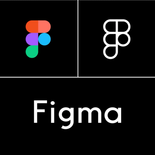
Figma Marks
The “Figma marks” (or “our marks”) are the words, logos, graphics, designs, and other indicators that identify Figma as the source of a product or service. For instance, the name and wordmark “Figma,” our black and white logo, and our colored logo are a few of our most important assets. By following these guidelines, you help us protect our valuable trademark rights and strengthen our brand identity. Download our logos here. By downloading our logos, you agree to use them in accordance with these guidelines.
Using the Figma Marks
You may use the Figma marks to identify Figma or its products so long as you are truthful, fair, and not misleading, and you comply with these guidelines, including Figma’s Style Guide. Don't have a Figma account? Download our Style Guide here.
Your own marks and branding should be larger and more prominent than the Figma marks. Use of our marks must not disparage or degrade Figma or others. Lastly, always use a Figma mark as an adjective (e.g., the Figma platform), not as a noun or verb, and never in the possessive form—unless talking about Figma, the company.
We may update these guidelines at any time. We also reserve the right to modify or revoke any permission we grant you to use our marks. You might have a separate written agreement with Figma including different or additional terms concerning usage of the Figma marks. If so, please follow the specific guidelines in your agreement.
Dos & Don'ts
🚫 Please don’t do this
You are not allowed to use the Figma marks in the following ways.
Don’t modify our marks in any way or integrate parts of our marks into your own.
Don’t put our name (or part of our name, e.g., “Fig”) in your company name, product name, domain name, or social media handle.
Don’t use our marks in a way that inaccurately implies affiliation, sponsorship, or endorsement by Figma.
Don’t imitate our visual identity—meaning, the distinctive look and feel of our marks or websites.
Don’t use our branding or marks on merchandise.
✅ Feel free to do this
You may use the Figma marks in the following ways if you follow these guidelines and our Style Guide.
Talking about Figma
You can refer to Figma or our products in an informational context in articles, websites, etc., in accordance with these guidelines.
Indicating compatibility
You can say your product or plugin works with, is compatible with, or was built using the Figma platform.
- Correct: Tom’s plugin for Figma design
- Incorrect: Tom’s Figma plugin
- Correct: Clara’s tutorials for FigJam
- Incorrect: Clara’s FigJam tutorials
Linking to our content
You can use the word “Figma” and our logos to link to Figma pages and content.
Educational purposes
You can use screenshots or video captures of our products and marks for educational purposes in teaching materials and school projects.
Questions
If you have questions about these guidelines, please contact legal@figma.com. To request permission to use the Figma Marks in ways not authorized in these guidelines, contact press@figma.com.
For issues regarding intellectual property not owned by Figma, please refer to our Copyright & Intellectual Property Policy.